This visualization was completed for the monthly Storytelling with Data Challenge. The June 2021 challenge was to use the color red as the predominate color in a visualization. Red can represent a lot of different domains – warning and danger, love and passion, energy and power, fire and heat. With all these potential meanings, coming up with a visualization wasn’t easy – I discarded a lot of ideas (not all of them bad) and stuck with my theme of saving the planet, or at least showing why we should be paying attention and making changes.
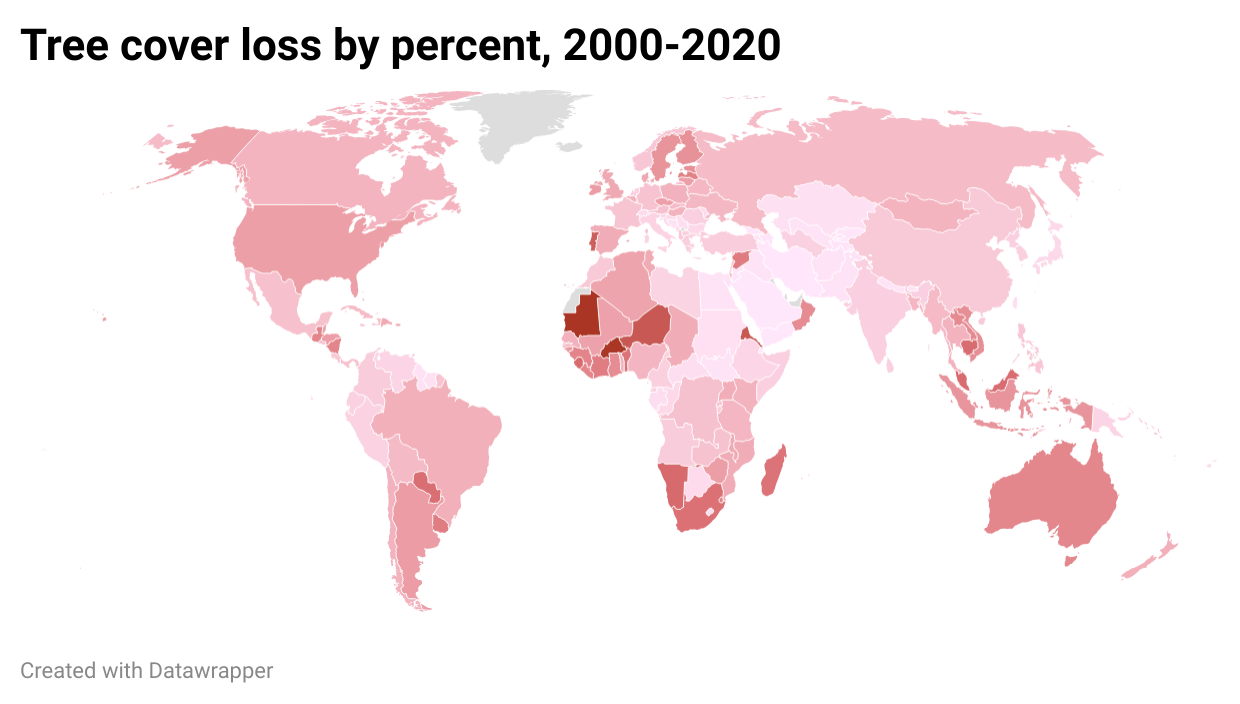
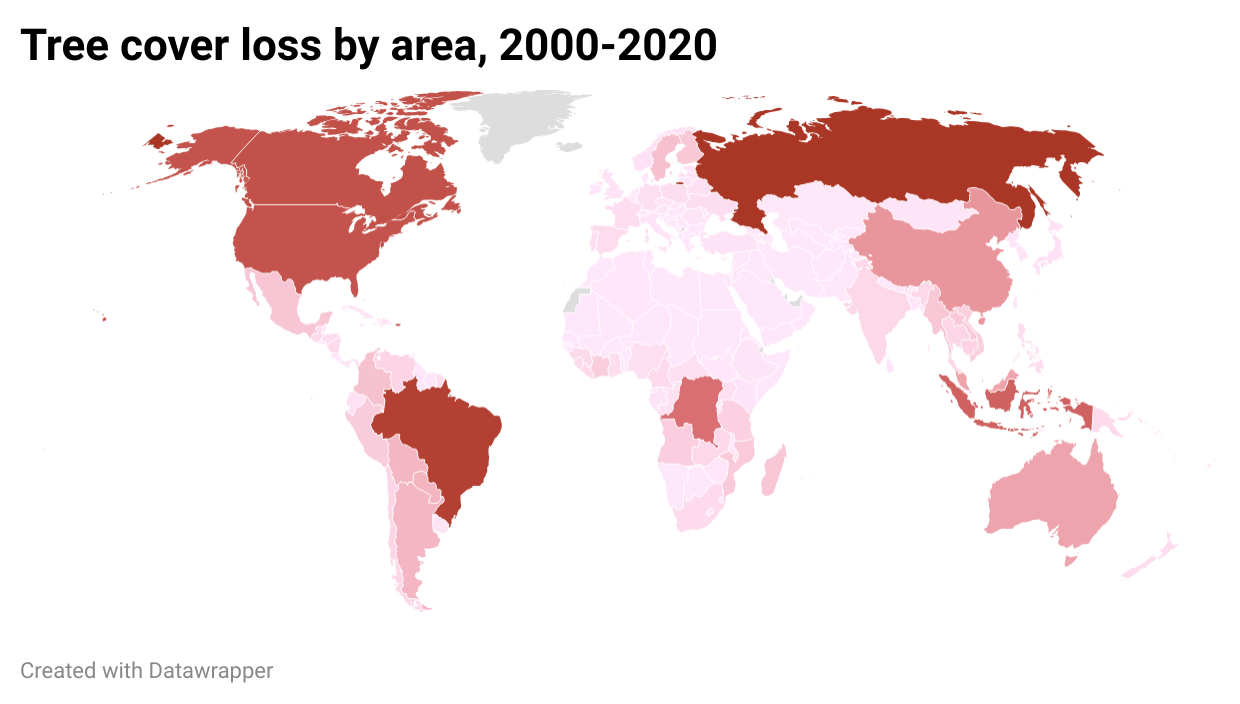
I wanted to demonstrate two methods of displaying tree cover loss data in the last 20 years. The first is by percent of cover lost, which is not the typical way to display this information, and the second is by area lost. There are some concerns with the data (e.g., missingness, large losses in some years and no loss in others), and I would like to expand on this visualization to better explain the land area, account for gains, and detail the ramifications of these losses.